The graph and pie charts below show the percentage of population aged between 18 and 34 years old in a particular country and the percentage of this age group of people living in different regions from 1978 to 2011.
方法1:一图一段
开头段
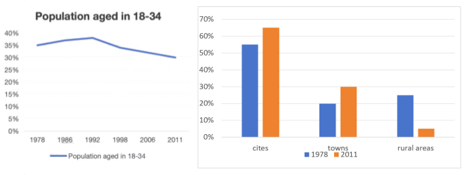
The line graph illustrates the proportion of the population aged 18 to 34 in a certain country from 1978 to 2011, and the bar chart compares the geographical distribution of this age group across urban, town, and rural areas in 1978 and 2011.
概述段
Overall, the surveyed age group experienced a falling trend over the given period. With more people migrating to cities and towns, the changes in their demographic distribution reflected the broader trend of urbanization.
思路要点:
- 18-34岁的人口比例整体下降
- cities、towns的人口比例上升,rural areas人口比例下降
Body paragraph 1
From the line graph, it is obvious that the share of 18-to-34-year-olds started at 35% in 1978. After a modest rise to a peak of 38%in 1992, this figure dropped significantly to just 30% in 2011.
思路要点:
- 1978年:35%
- 随后逐步上升,1992年达到峰值38%
- 随后显著下降,到2011年达到30%
Body paragraph 2
In terms of the geological distributibution of this age group, we can see from the bar chart that in 1978, 55% of the people lived in cities, roughly twice the proportion in rural areas(25%) and towns(20%). By 2011, the percentages of people residing in urban areas and towns had both increased by 10%, while those living in rural areas had plunged to just 5%.
思路要点:柱图
- 1978年,cities数值最·高(55%), 大约是rural areas(25%)、towns(20%)的两倍
- 2011年,cities、towns数值显著上升了10%,rural areas数值急剧下降到5%